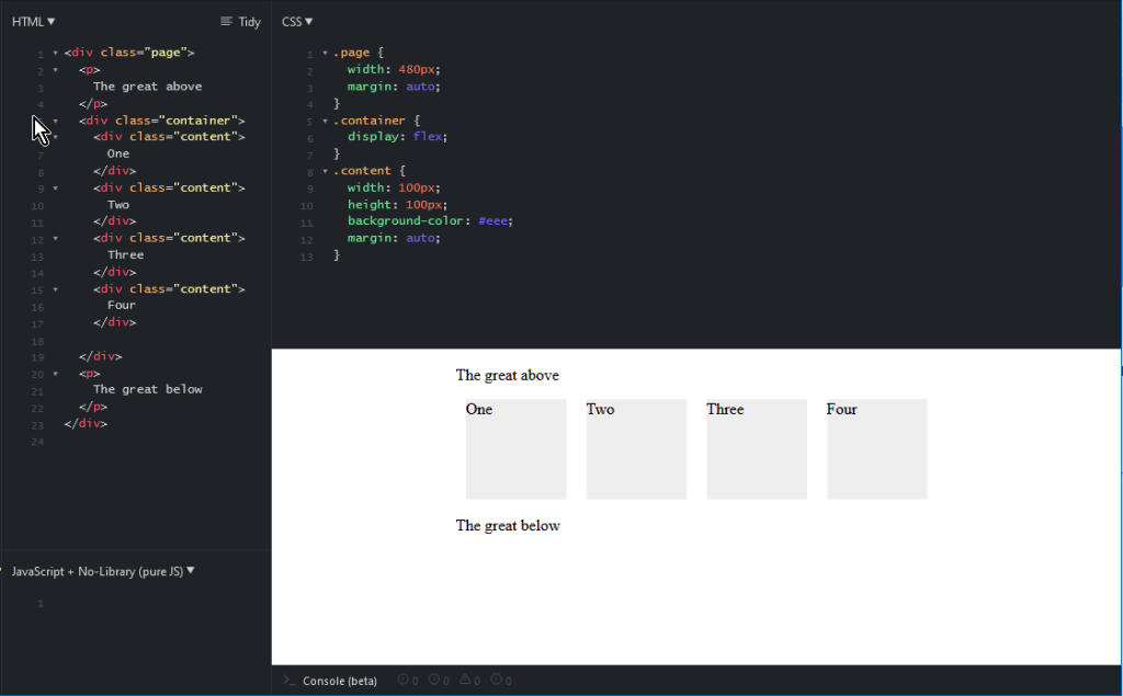
Establish the main container either inline or as block (below as block). All the children will pop into the container.
.container {
    display: flex; /* inline-flex */
}
Next, we can establish the direction of the flex, going left,right, down or up
.container {
    display: flex;
    flex-direction: row /* row-reverse, column, column-reverse *.
}
Next, we establish what we want to do with wrapping. The default is all goes in a single line, but we can specify a wrap.
.container {
    display: flex;
    flex-direction: row;
    flex-wrap: wrap; /* nowrap, wrap-reverse */
}
Next important part is justify-content, which let us align to a side, or center, or justify along the entire row:
.container {
    display: flex;
    flex-direction: row;
    flex-wrap: wrap;
    justify-content: center; /* flex-start, flex-end, center, space-evenly, there are more, but browser support is varying */
Spacing, the gap property controls the space in between items, NOT around the outer edges. (which will often be exactly what you want). If you also inject whatespace with the justify-content option then the gap will guarantee a minimum.
.container {
    ...
    gap 10px 20px; /* row gap 10px, column gap 20px */
}